Zillow Web Redesign
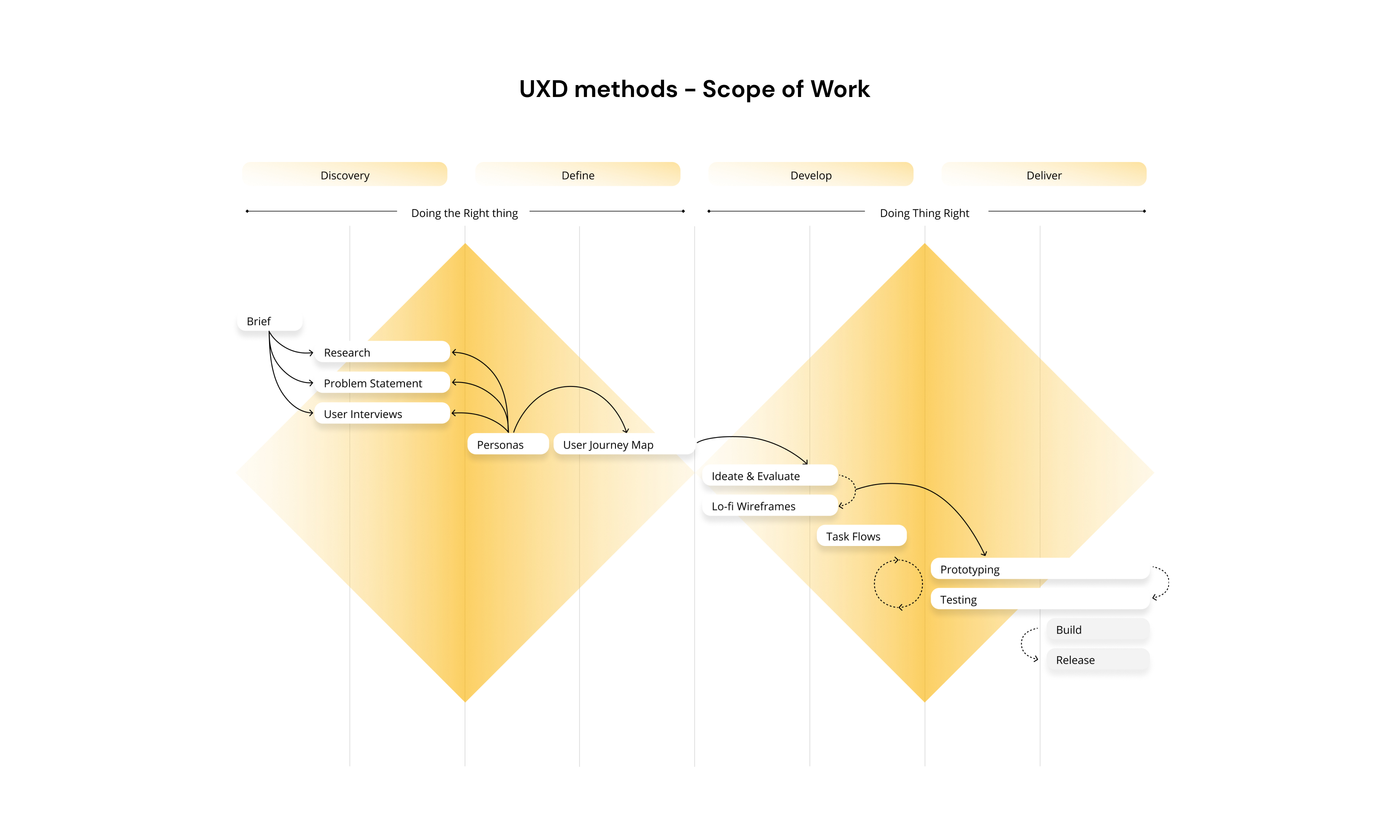
Research
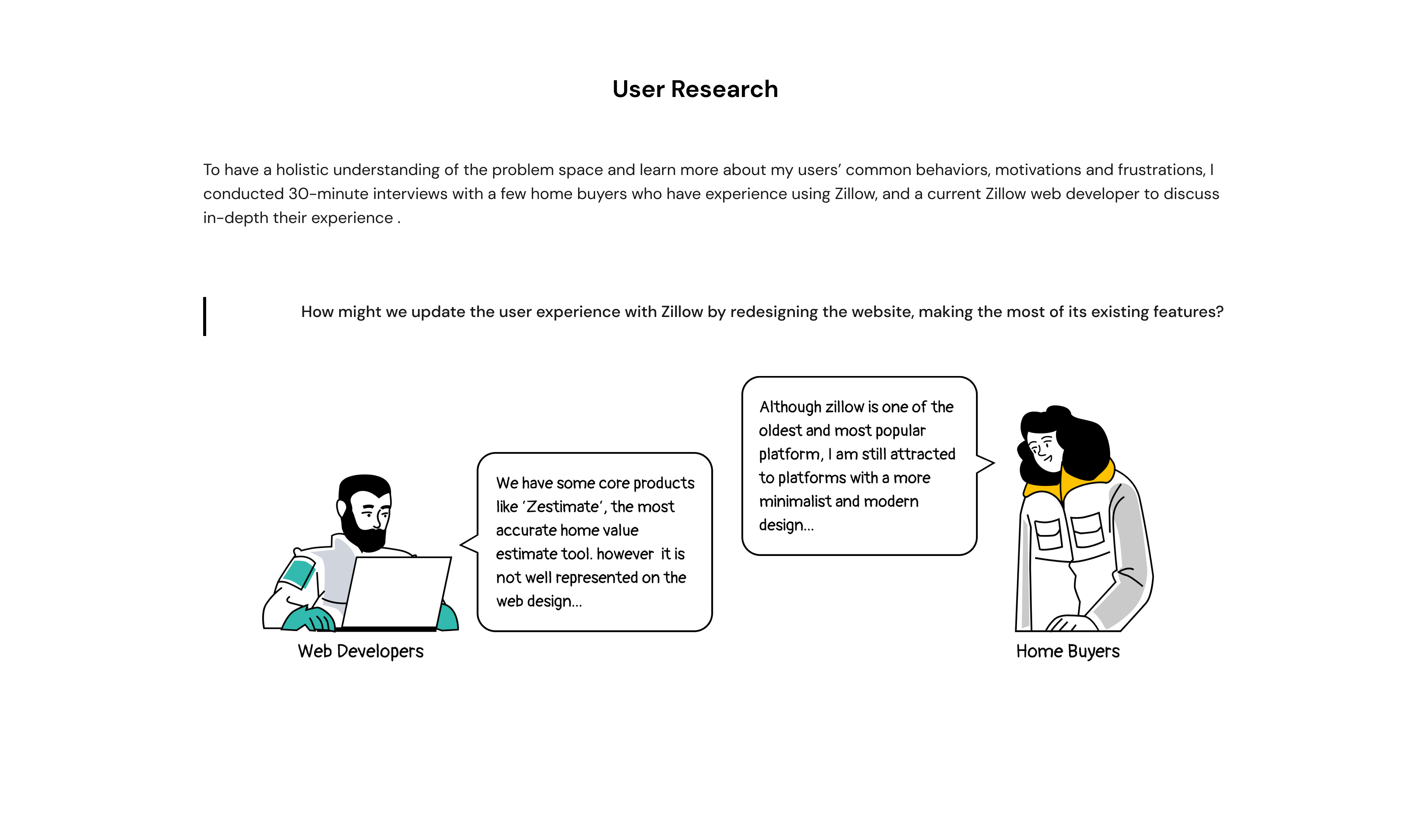
I conducted 30-minute interviews with a few home buyers between the ages of 25 to 44 who have experience in using Zillow.
Rethink
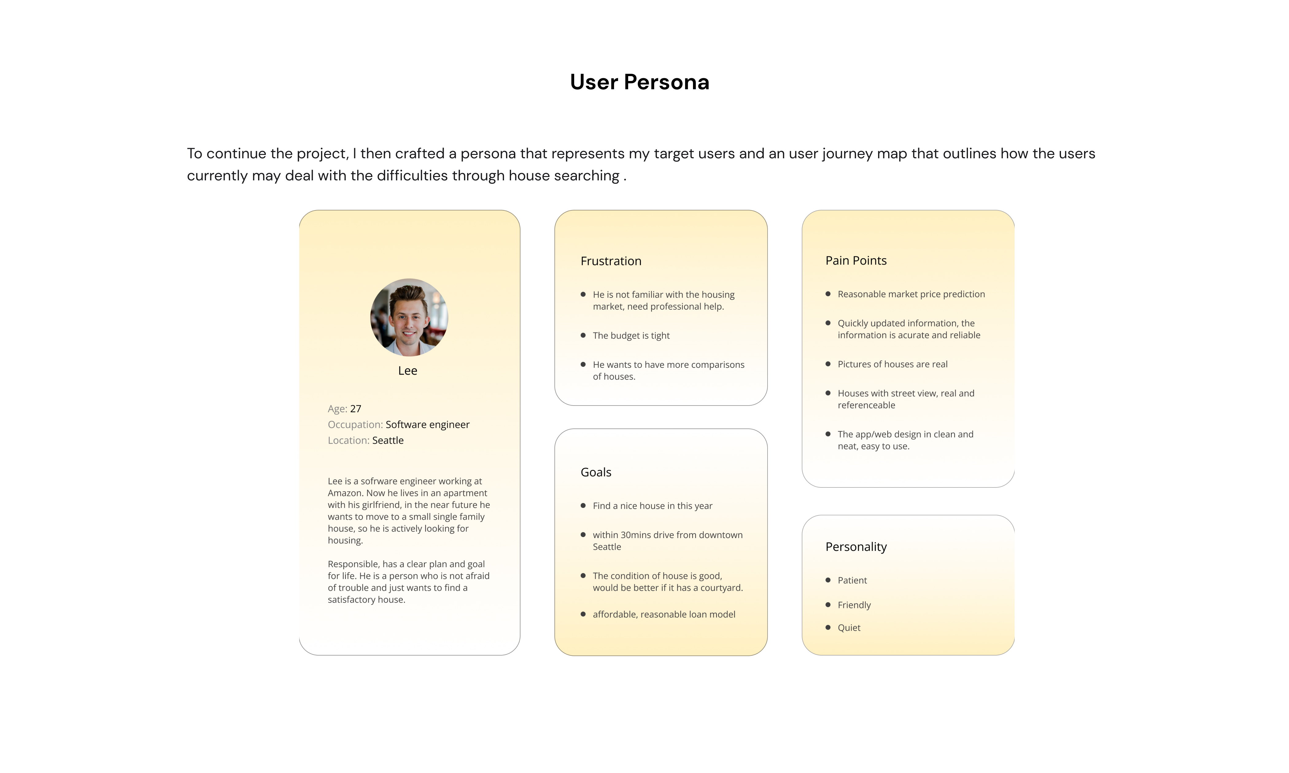
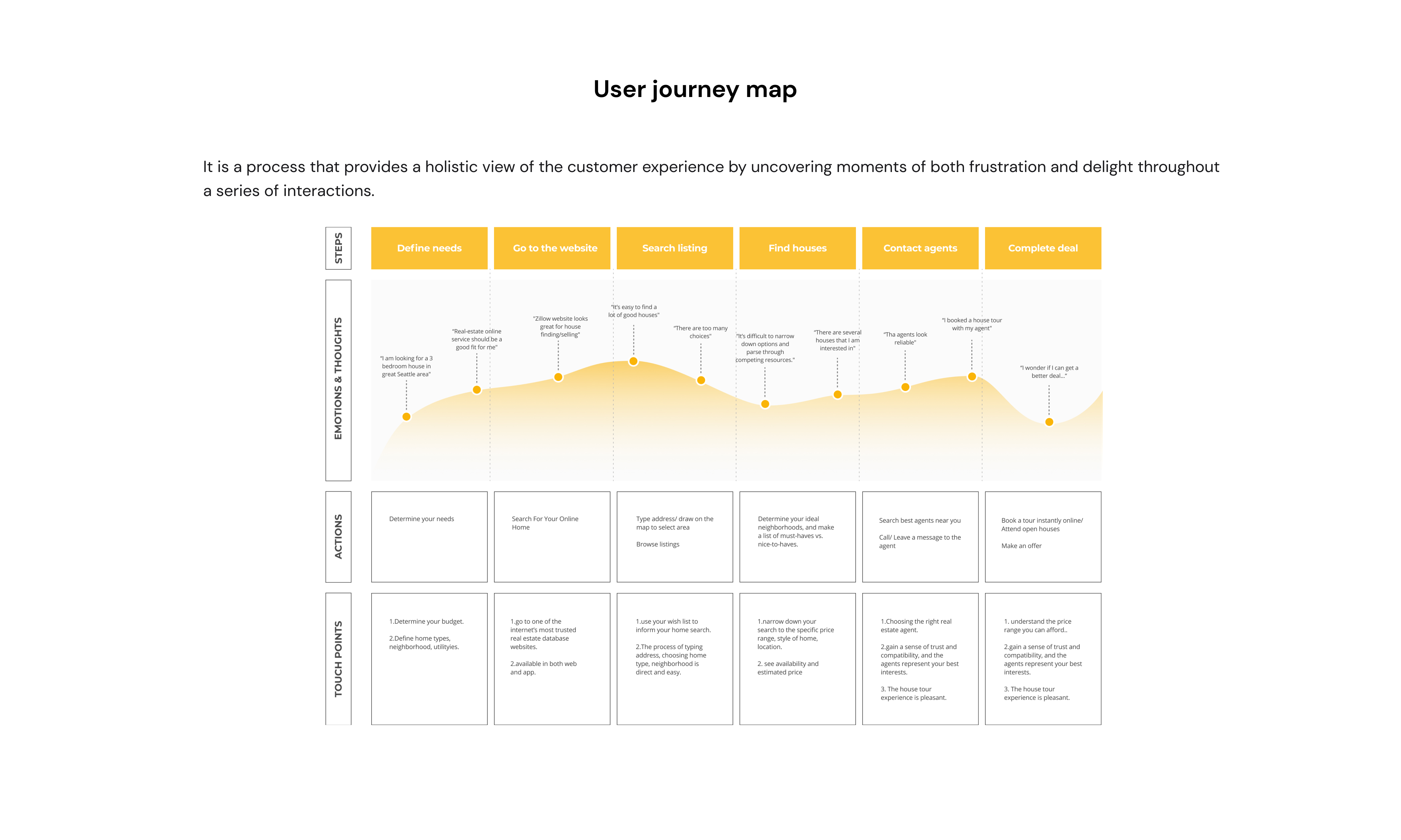
I build empathy with my target users and to stay user-centred while identifying opportunities where I could intervene with my digital solution.

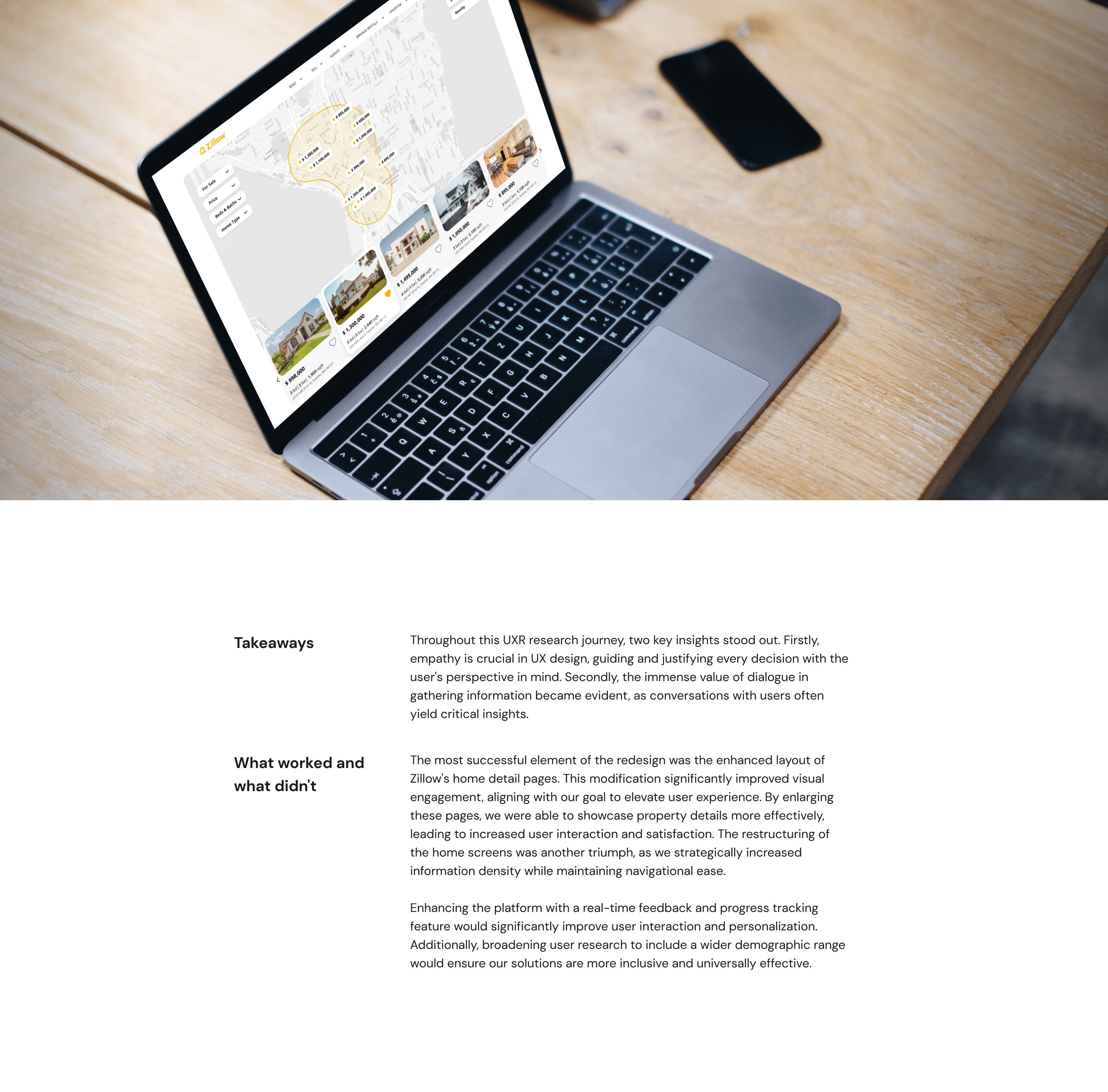
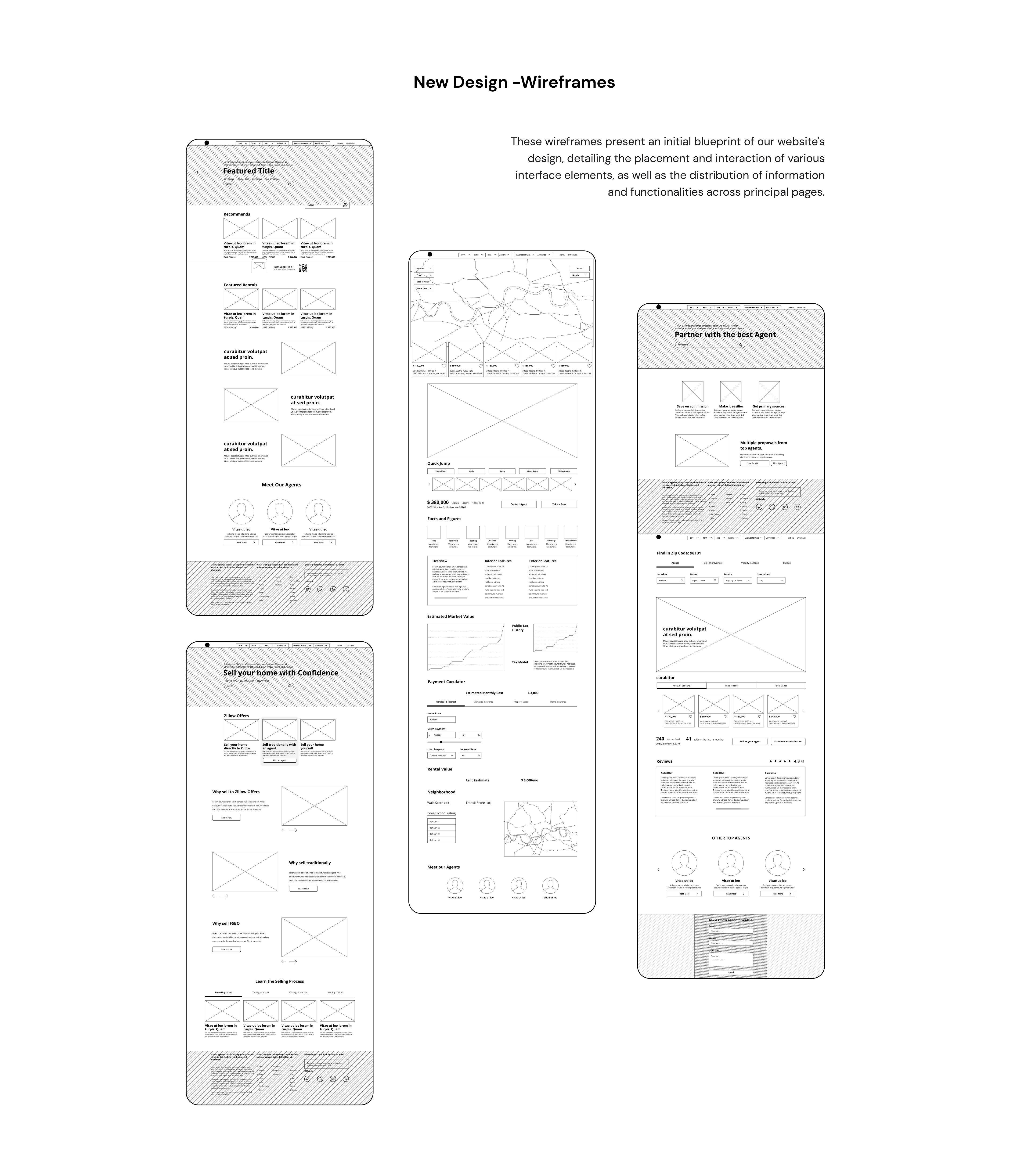
Home Screen
The home screens of Zillow have undergone a strategic redesign, focusing on elevating information accessibility and enhancing user interface efficiency. In response to user feedback, we have increased the information density, resulting in a more informative and navigable homepage.
Home Screen
The home screens of Zillow have undergone a strategic redesign, focusing on elevating information accessibility and enhancing user interface efficiency. In response to user feedback, we have increased the information density, resulting in a more informative and navigable homepage.
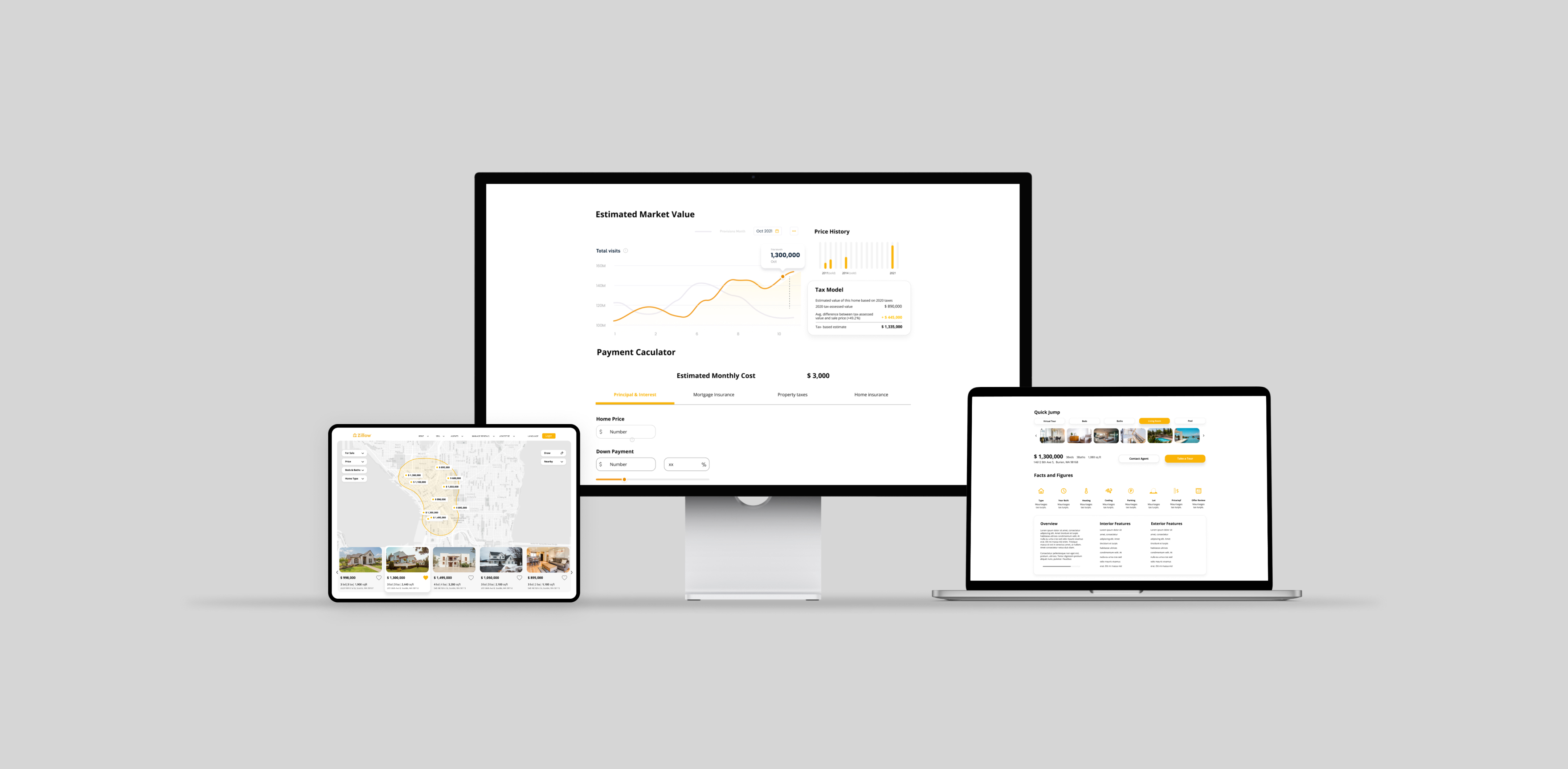
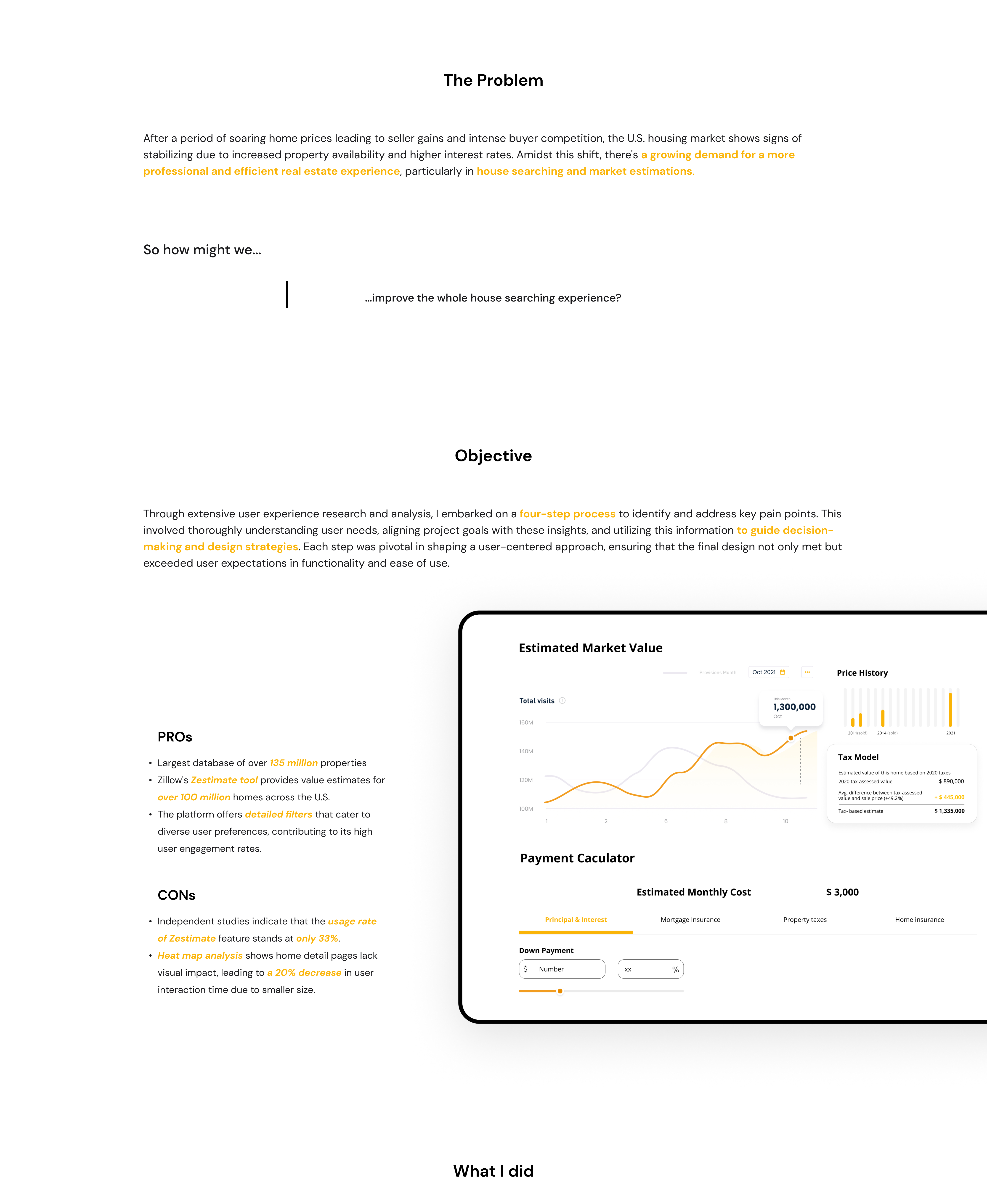
Home Detail Page
Addressing user concerns, we have expanded the layout and refined the image display, significantly enhancing the visual appeal and interactivity. This redesign is aimed at presenting property details in a more compelling and user-centric manner, thereby increasing user engagement time.
Home-Sell Interface
The reimagined home-sell interface represents a significant leap in facilitating an user-friendly selling experience. Acknowledging user feedback, I have refined the interface to improve the clarity and accessibility of vital information and streamline the navigation process.
Agent Page
The redesigned agents section on Zillow is a testament to our dedication to enhancing professional connections within the real estate market. The redesign focuses on improving the visibility and accessibility of agent profiles, directly addressing the needs and preferences of our users.